

The MTA Is A Typographer’s Dream
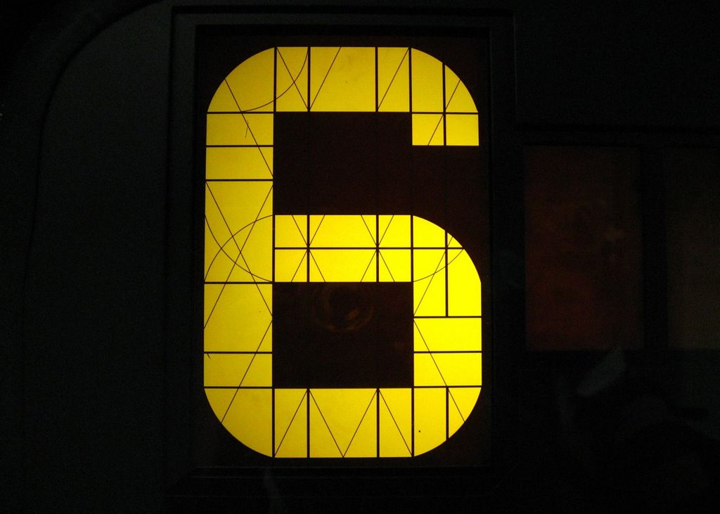
A couple weeks ago, as the doors of a 6 train were opening, I was struck by the typography on the outside of the train. Of the lit line signs, most are either LCD-like a crude calculator, or LED-looking like the crosswalk. But here was an LCD that had this beautiful criss-cross of lines that enable the train to change lines and maintain nice smooth typography.
Based on NYCsubway.org photos, they appear to be a variation of R142 or R143, and not new enough to be a R160. There may have been some sign revision among R143s.

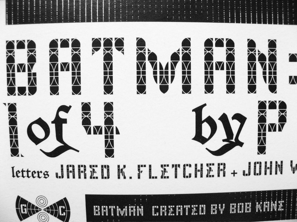
It recalled the wonderful typography in Paul Pope's Batman 100 series, as done by Jared K Fletcher and John Workman. Below is a detail and larger portion of the credit page.

Here are text samples


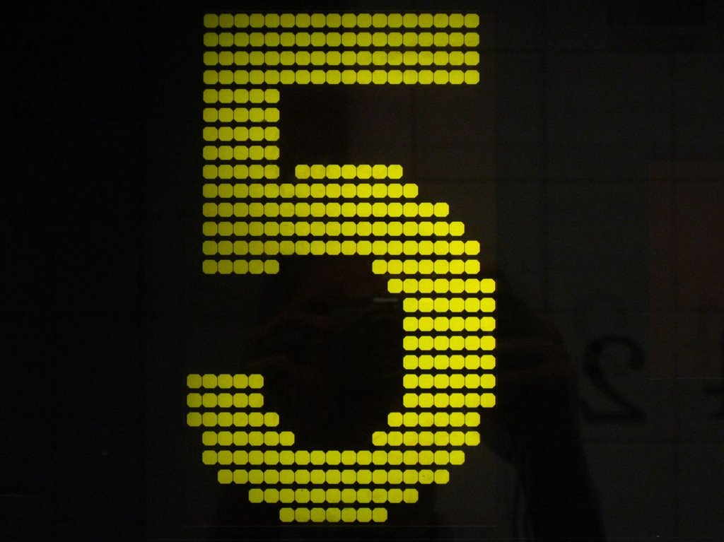
And other line signs... Even though the 5 is in dots, the directional text would be like those above.


Bonus points for those who caught the Adam Bock/Clubbed Thumb reference in the title.
Labels: Batman, clubbed thumb, MTA, Typography
posted by Sam Teigen @ 9:35 AM
![]()
![]()
0 Comments:
Post a Comment
<< Home